University of Redlands Web Design Class
Teaching web design to a new generation of students using Figma
My role
Instructional design
My methods
Pedagogy, UX design, UI design
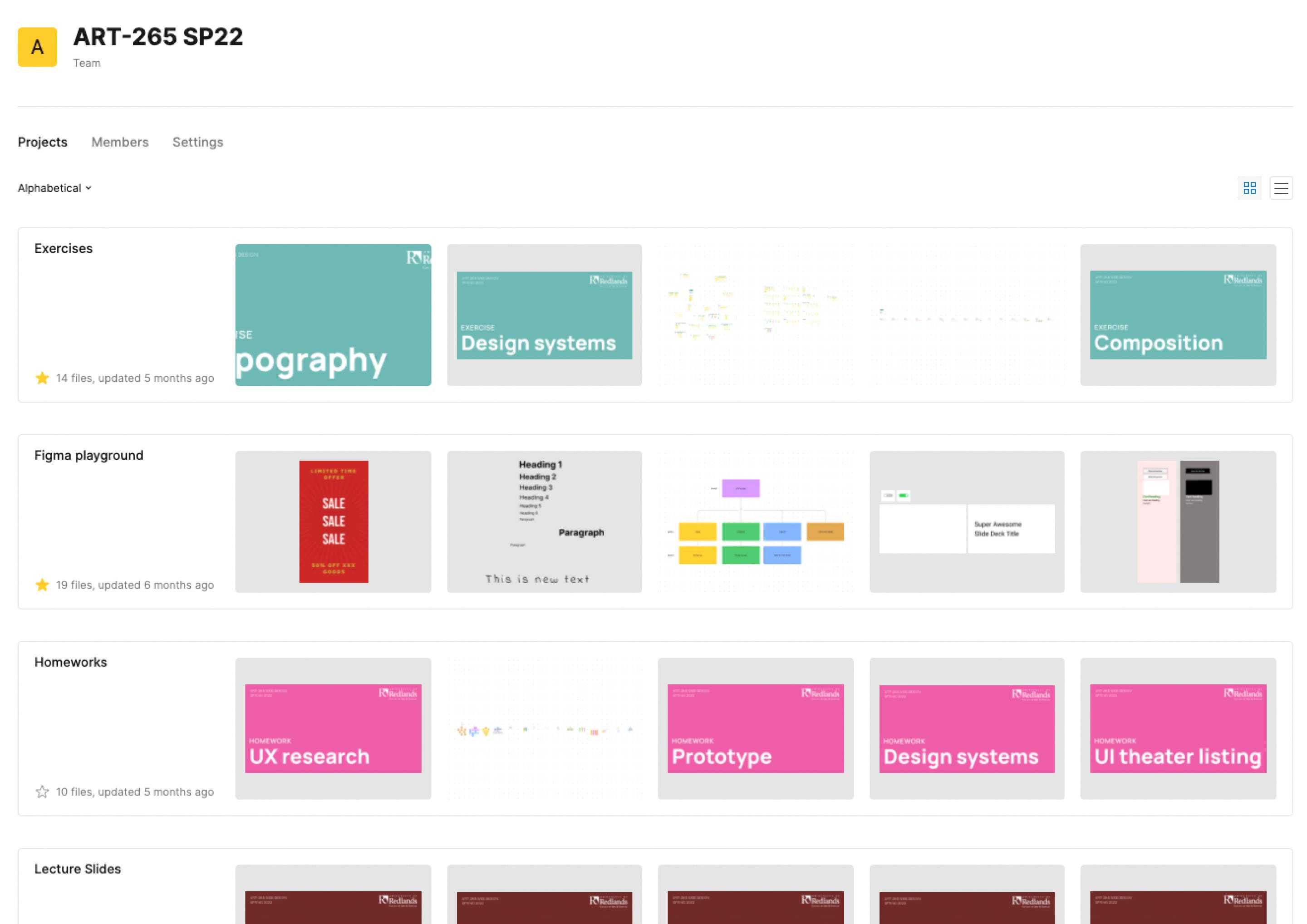
In the spring of 2022 I designed and taught a university web design course completely within Figma. Figma served as the repository for all lecture slides, in-class exercises, and graded assignments. I designed the course to cover a broad spectrum of modern web design topics not solely focused on code (which so many “web design” courses at the university level focus on). Topics I taught in this class included UX design, UI design, visual hierarchy, information architecture, design careers, front-end development, and of course Figma.
Context
In 2019, I was approached about teaching a web design class at a local university as a colleague who had taught it for many years was taking a break. I was free to redesign the course curriculum and develop it in a way I saw fit with one caveat: whatever I developed needed to function as an in-person studio class. After meeting with the department chair and understanding their goals for the course, I went to work.
Teaching components
The first step of designing the course curriculum was to research existing and adjacent courses at the university in order to build the course syllabus. From there I casted a wider net to see what other universities were teaching when it came to this topic, while also soliciting feedback on social media and talking to colleagues asking such questions as “what do you wish you would have learned about design?” or “what did you wish you would have known before starting a web design career?”.
I also researched some pedagogy when it comes to teaching web design, and most of what I found was focused on teaching web development.



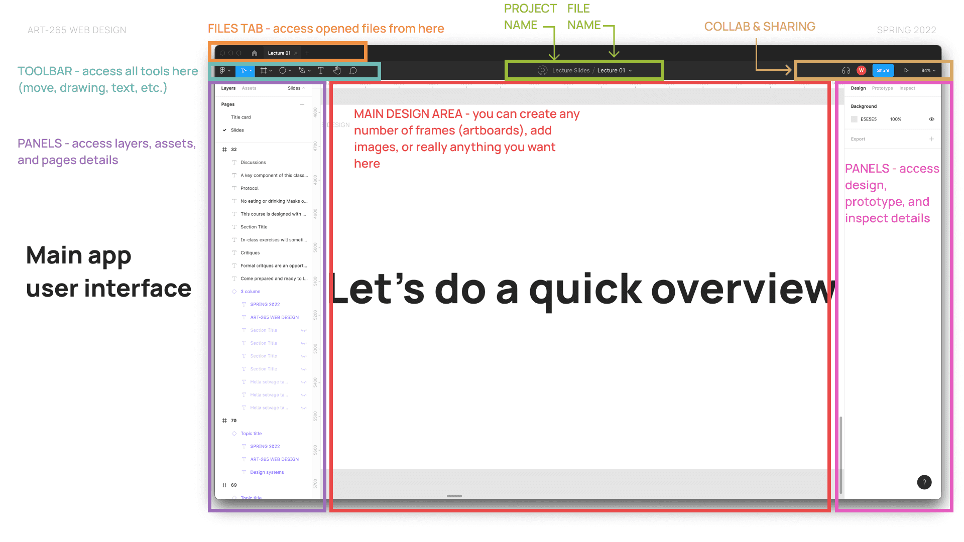
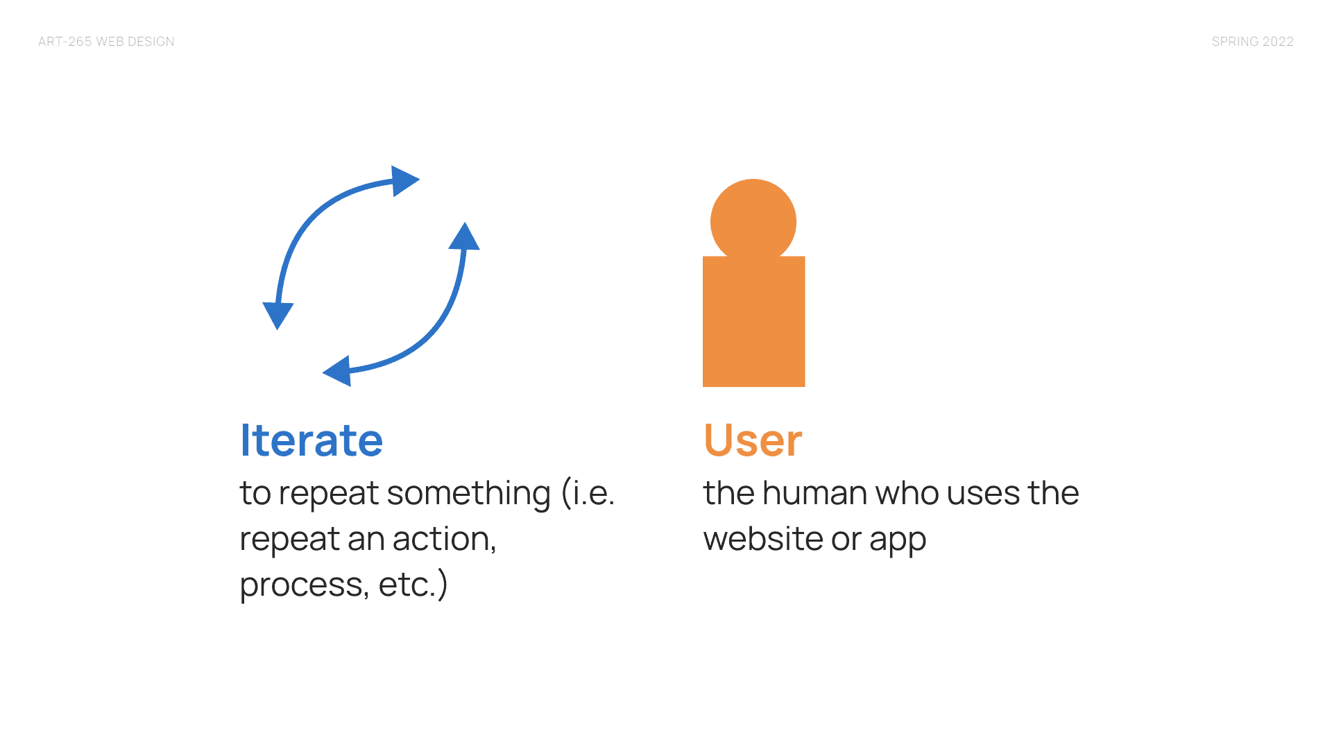
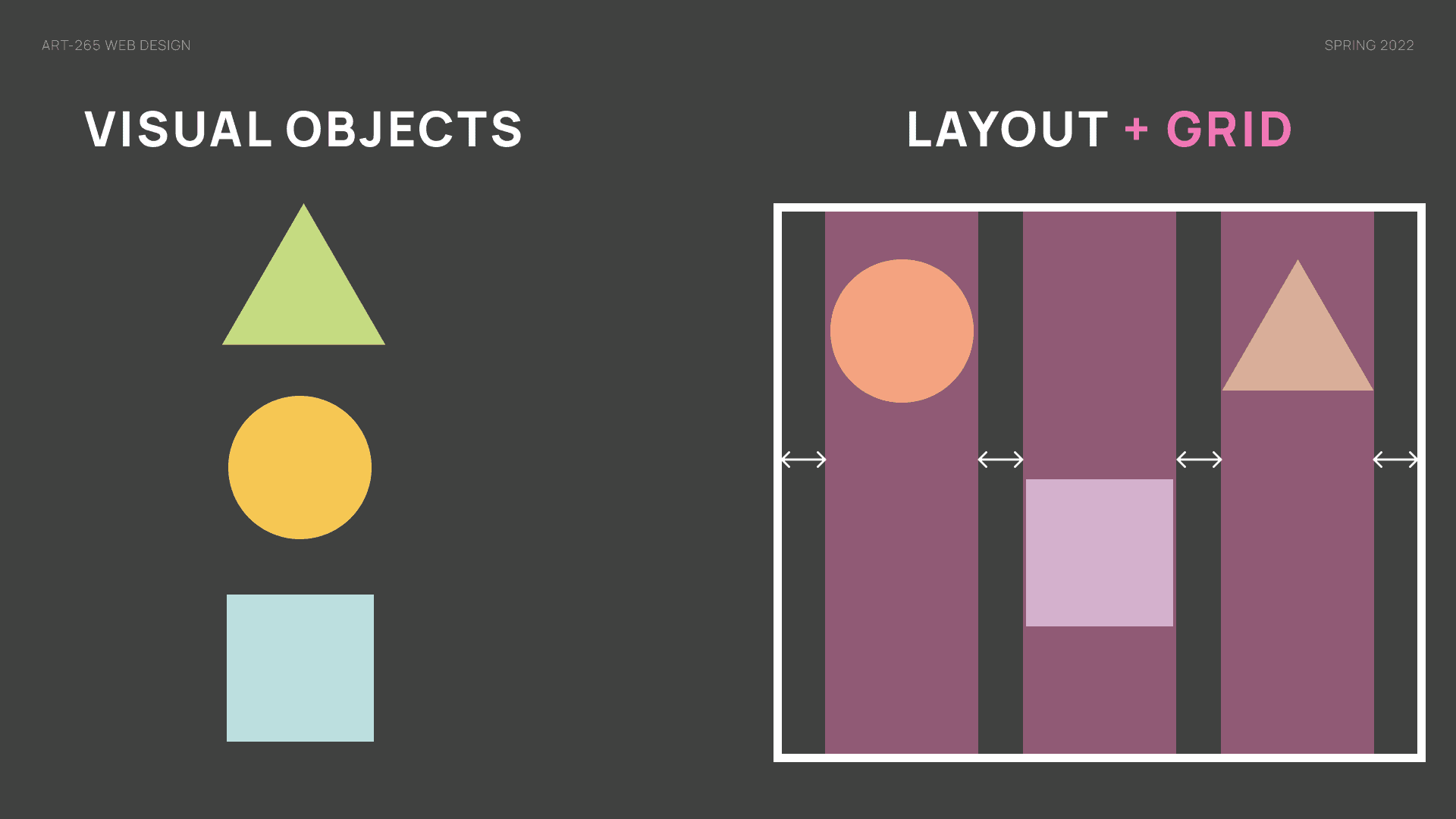
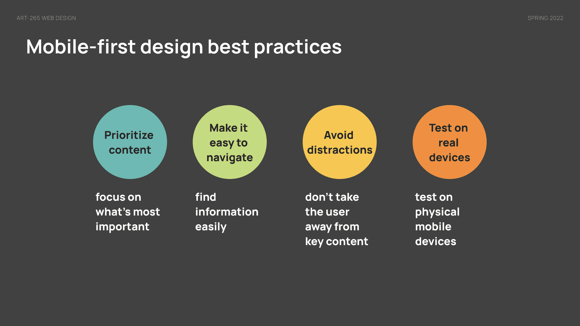
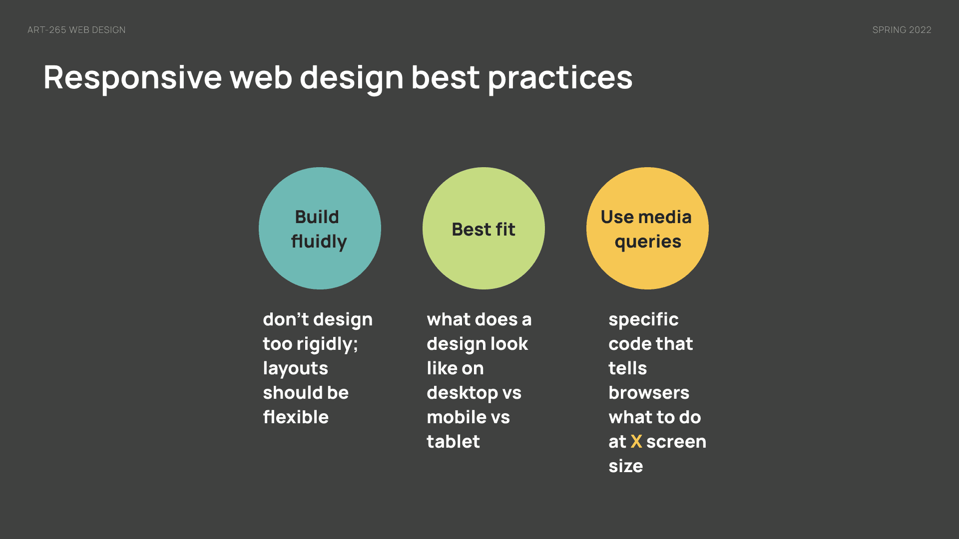
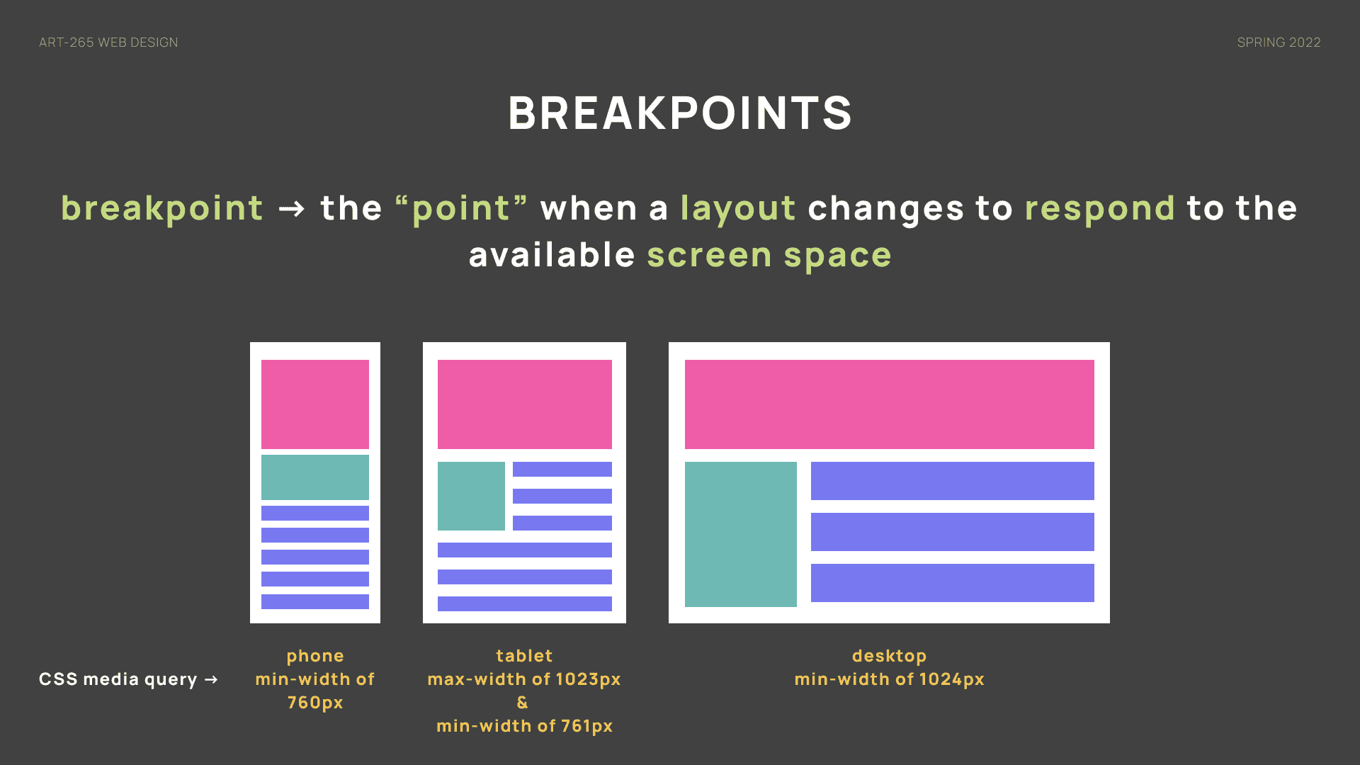
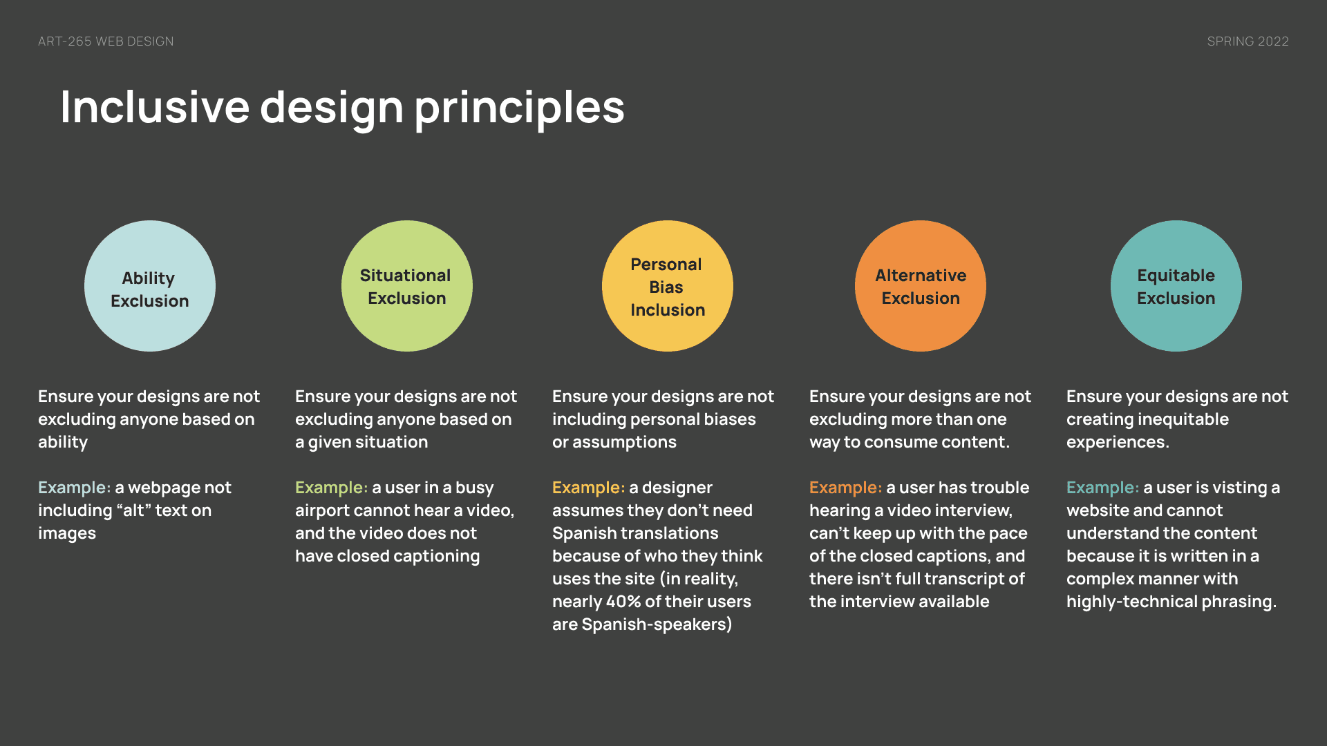
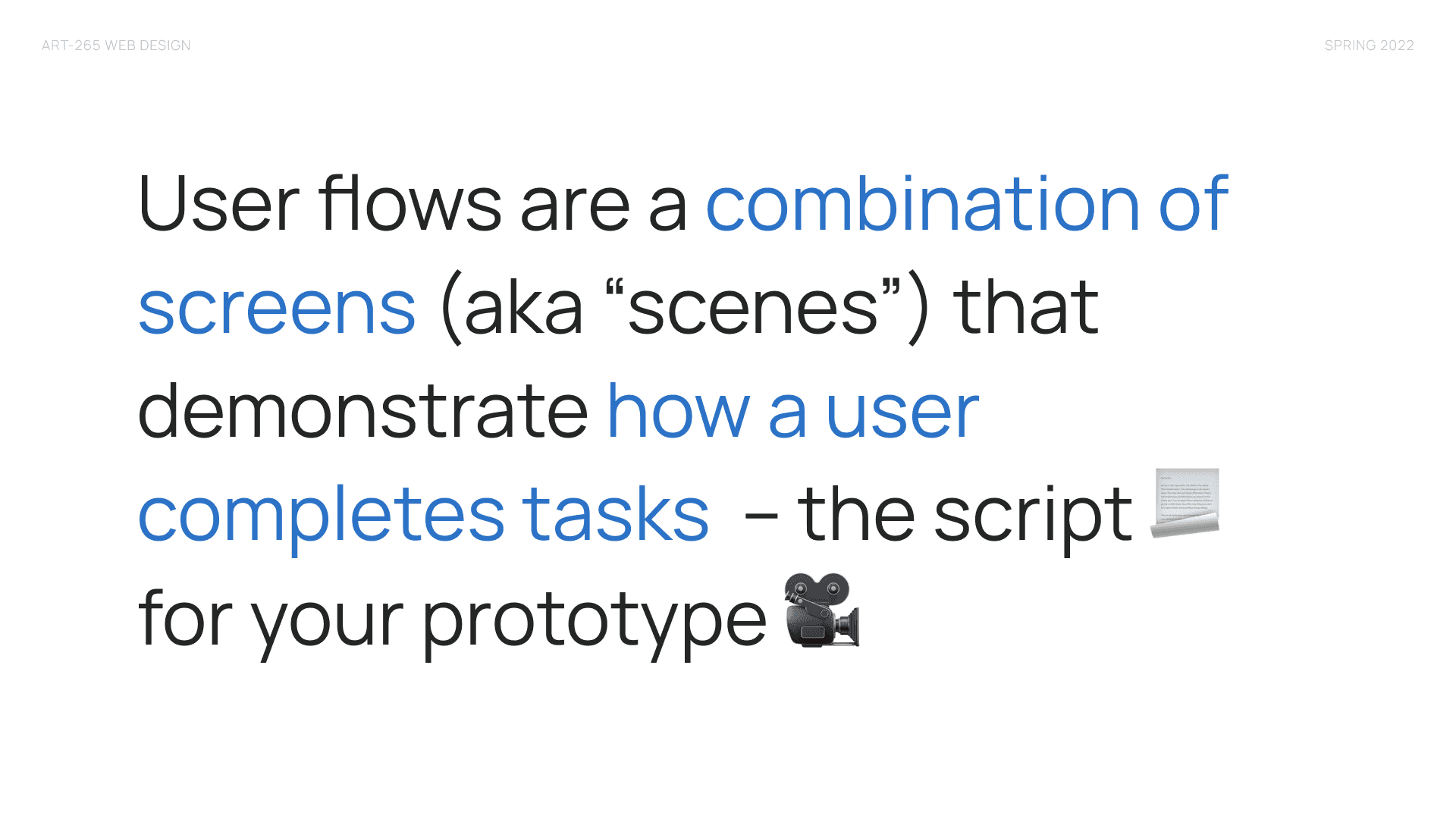
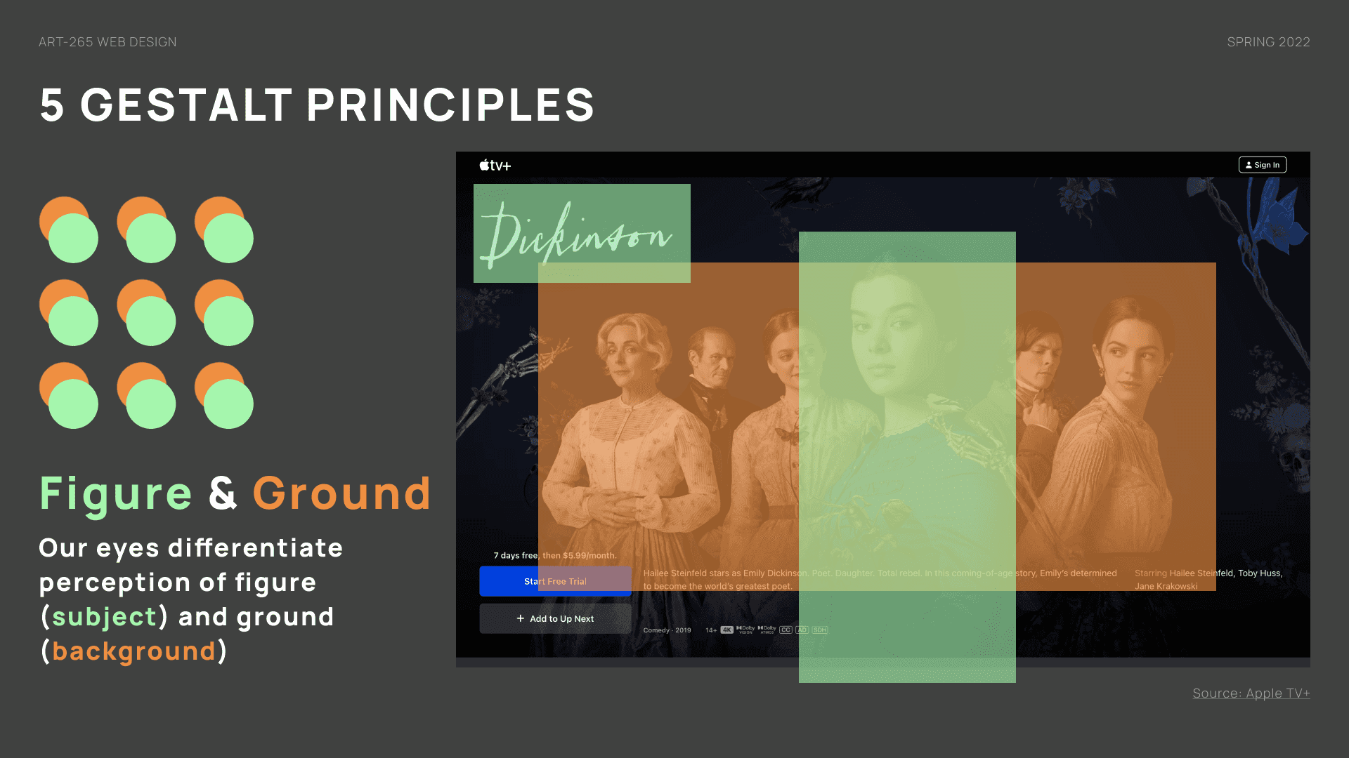
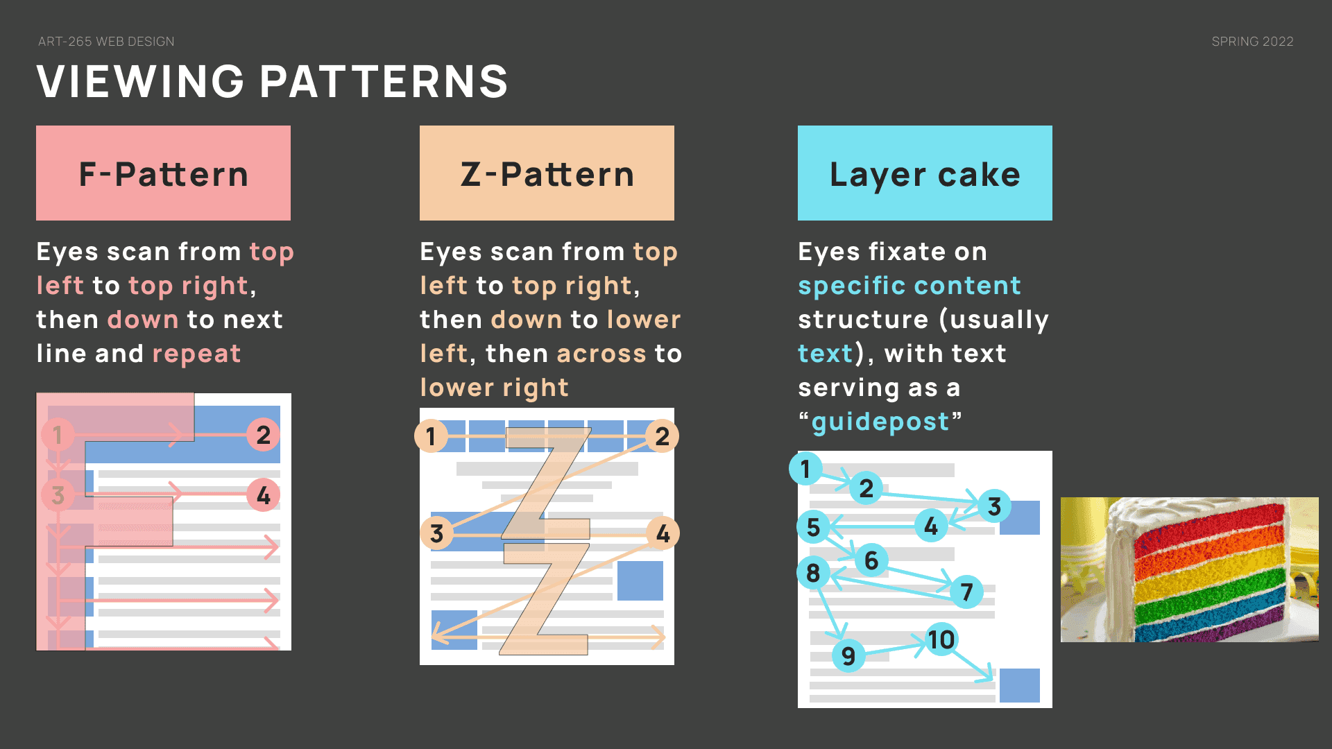
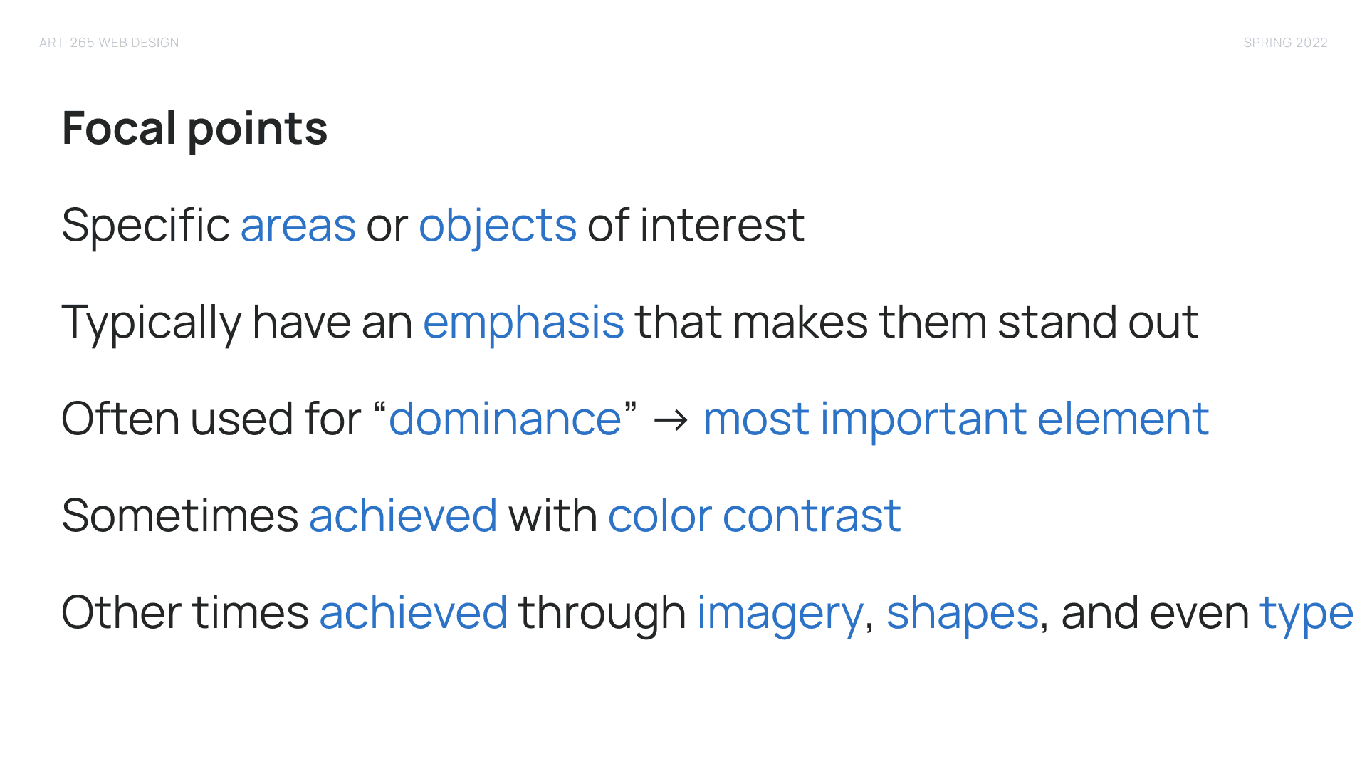
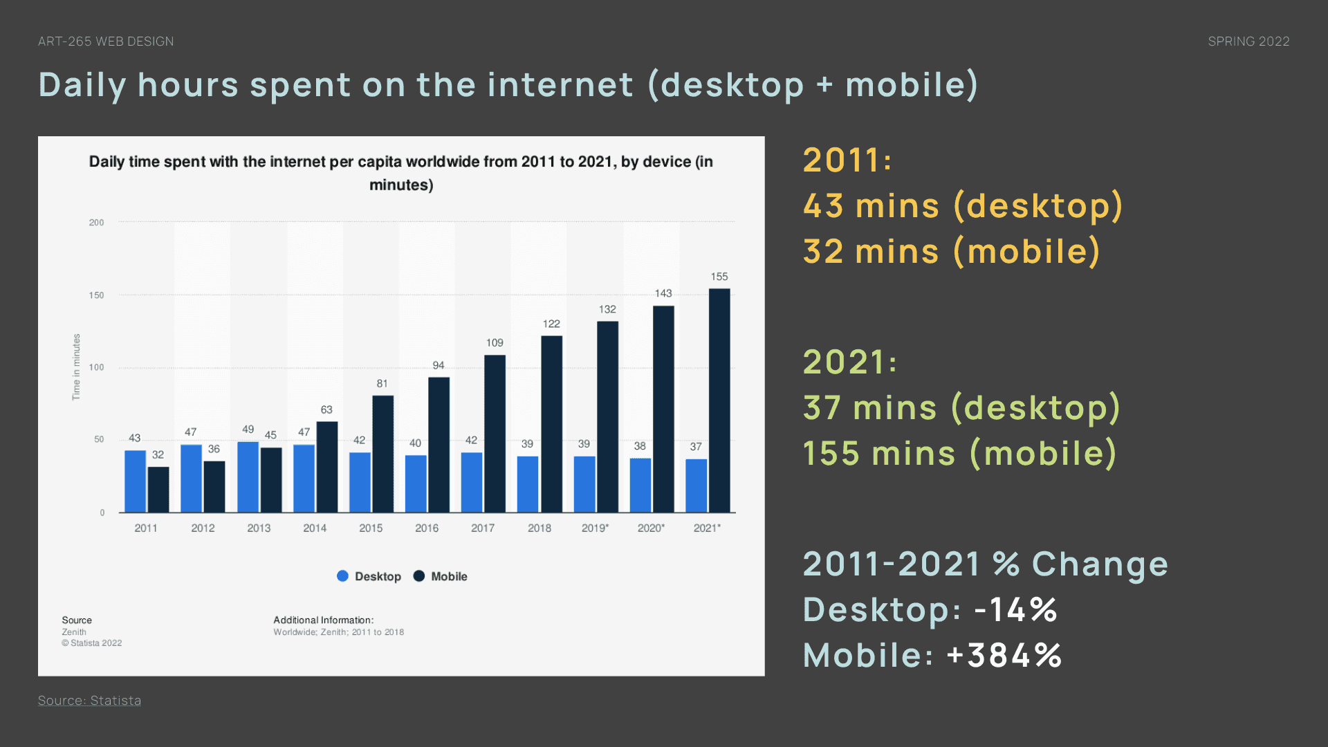
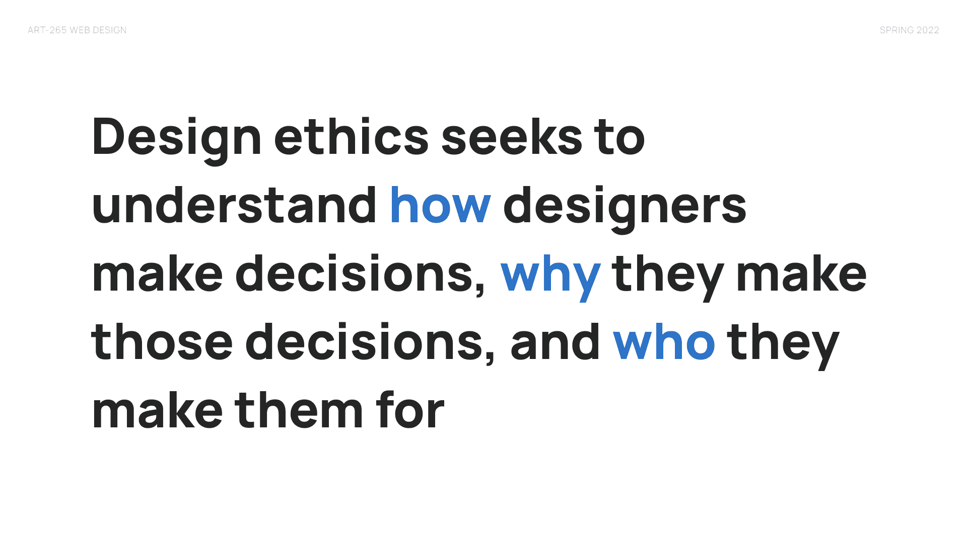
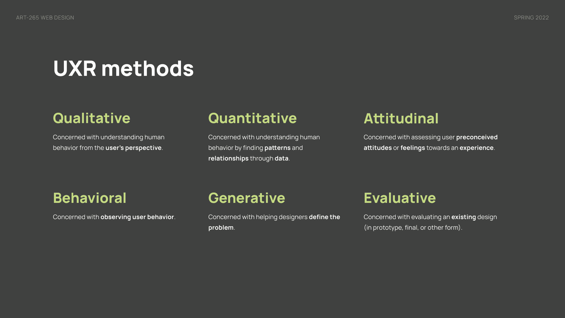
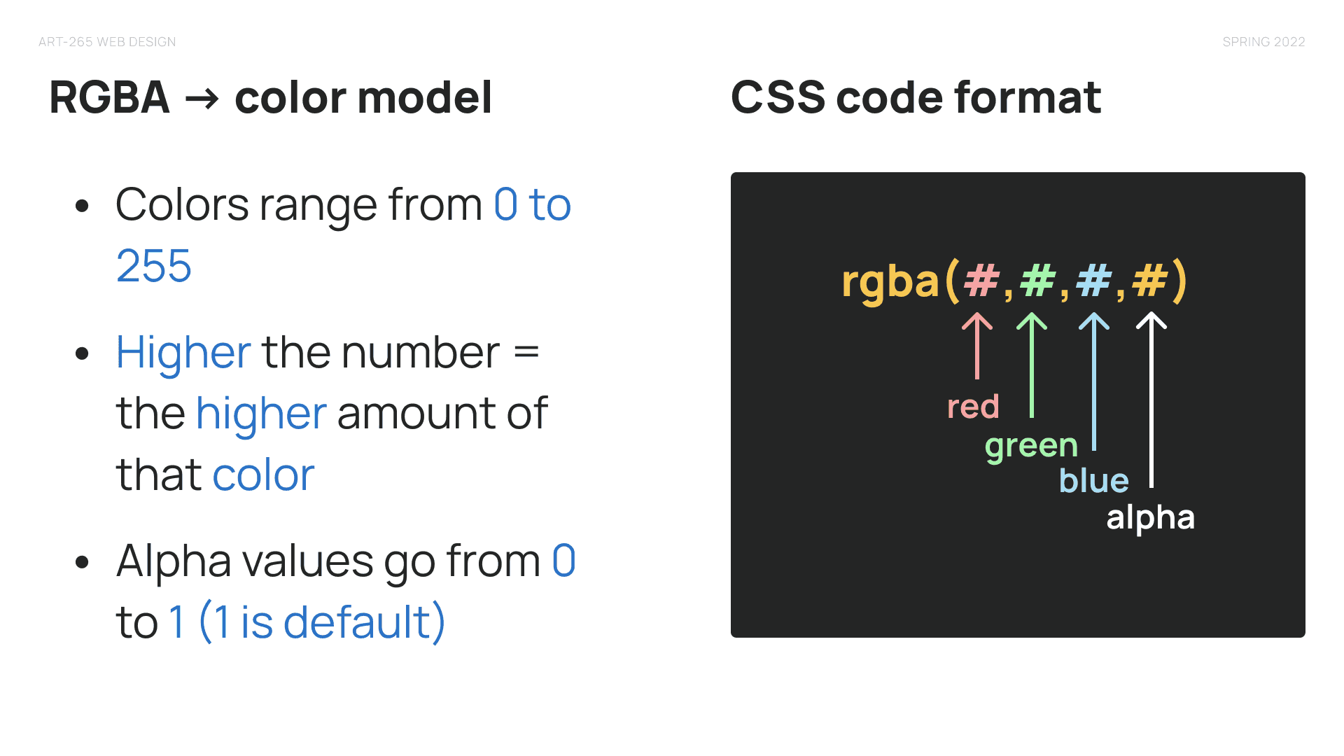
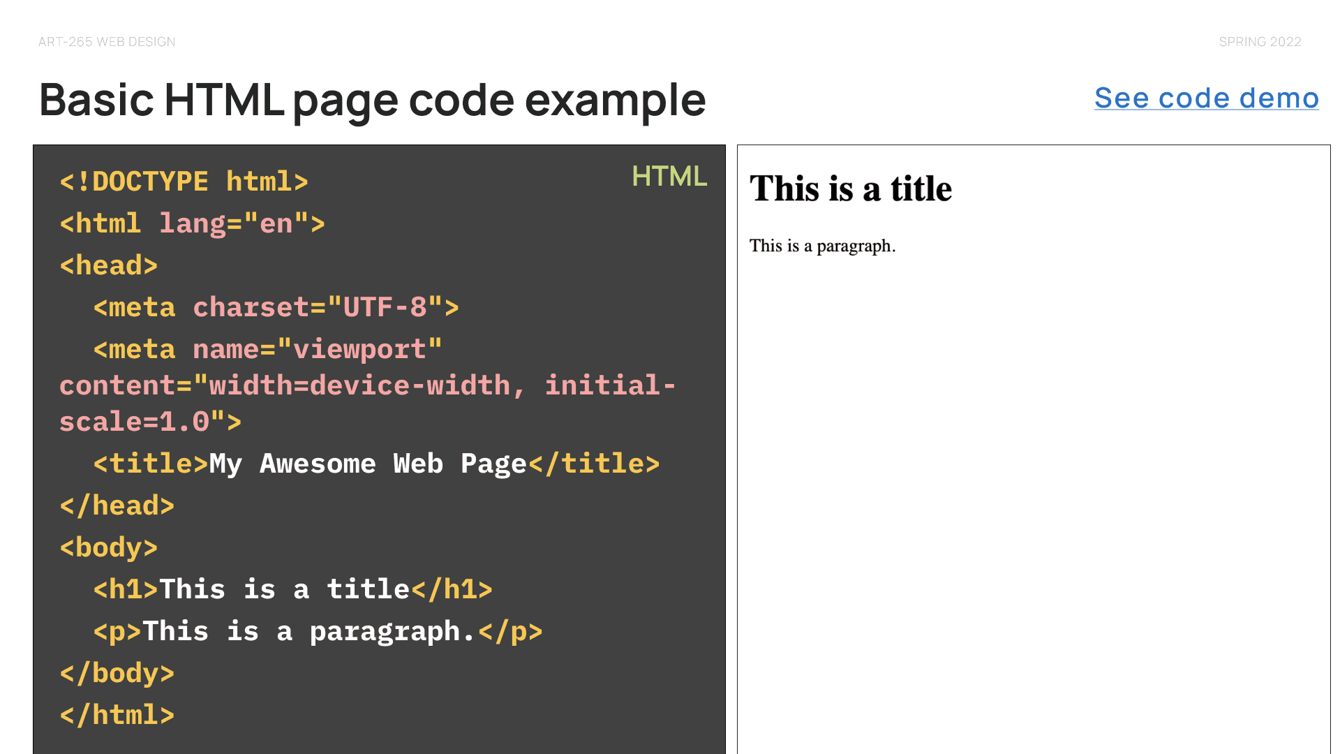
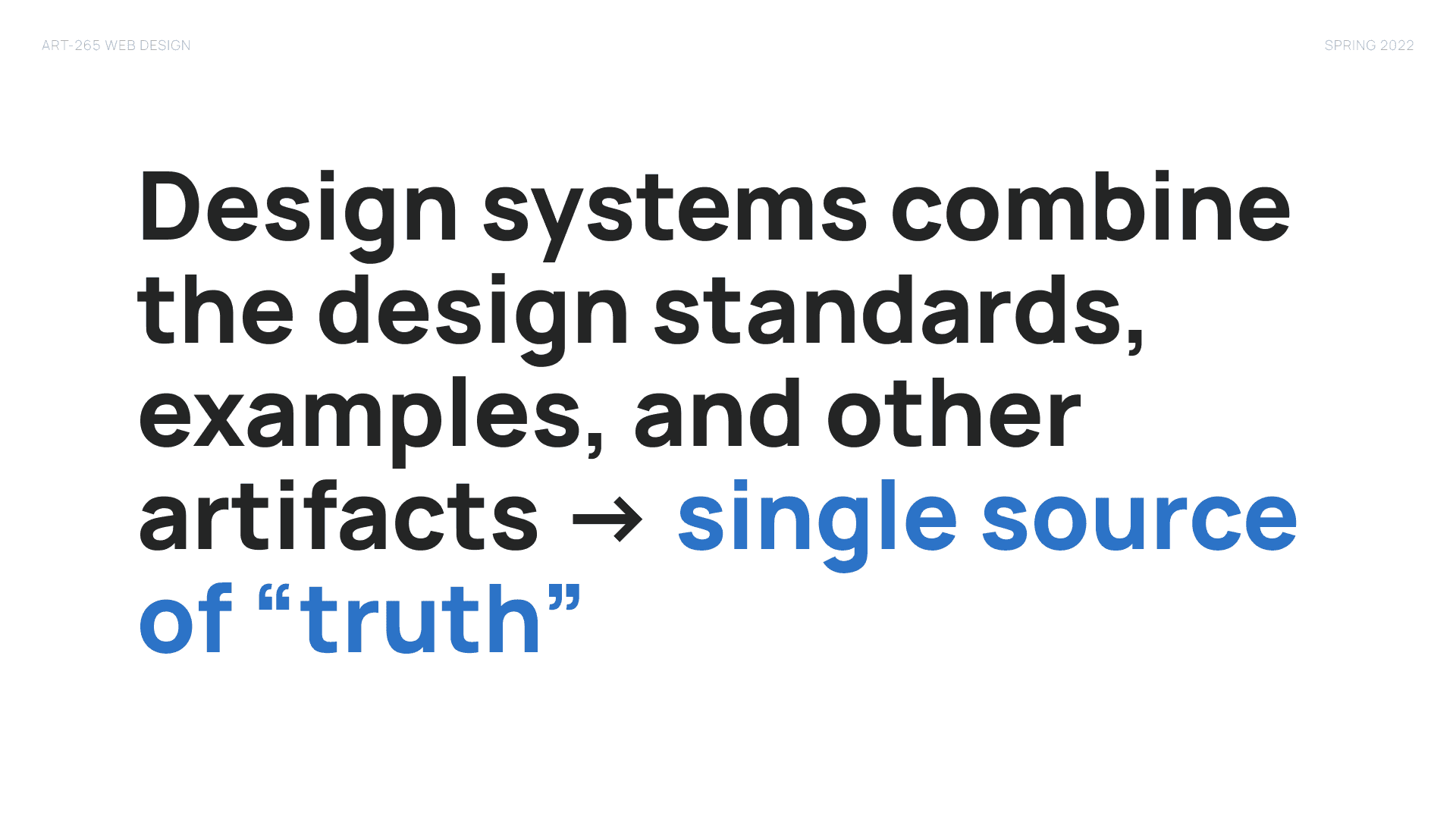
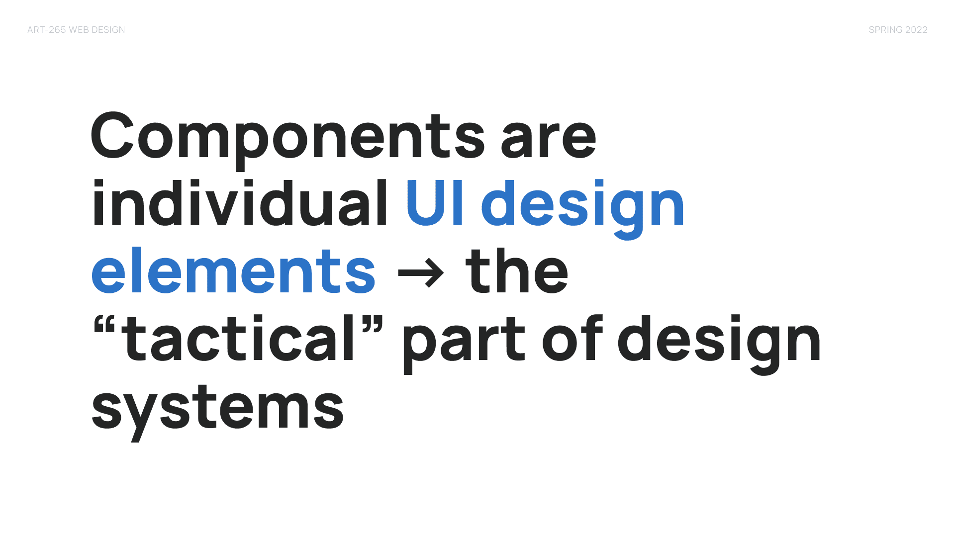
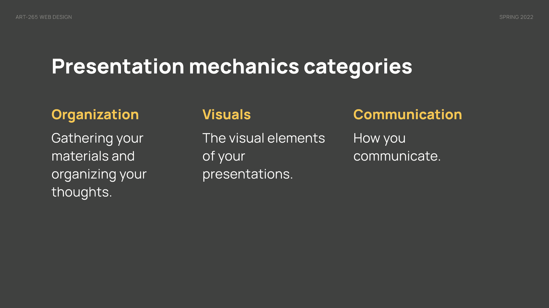
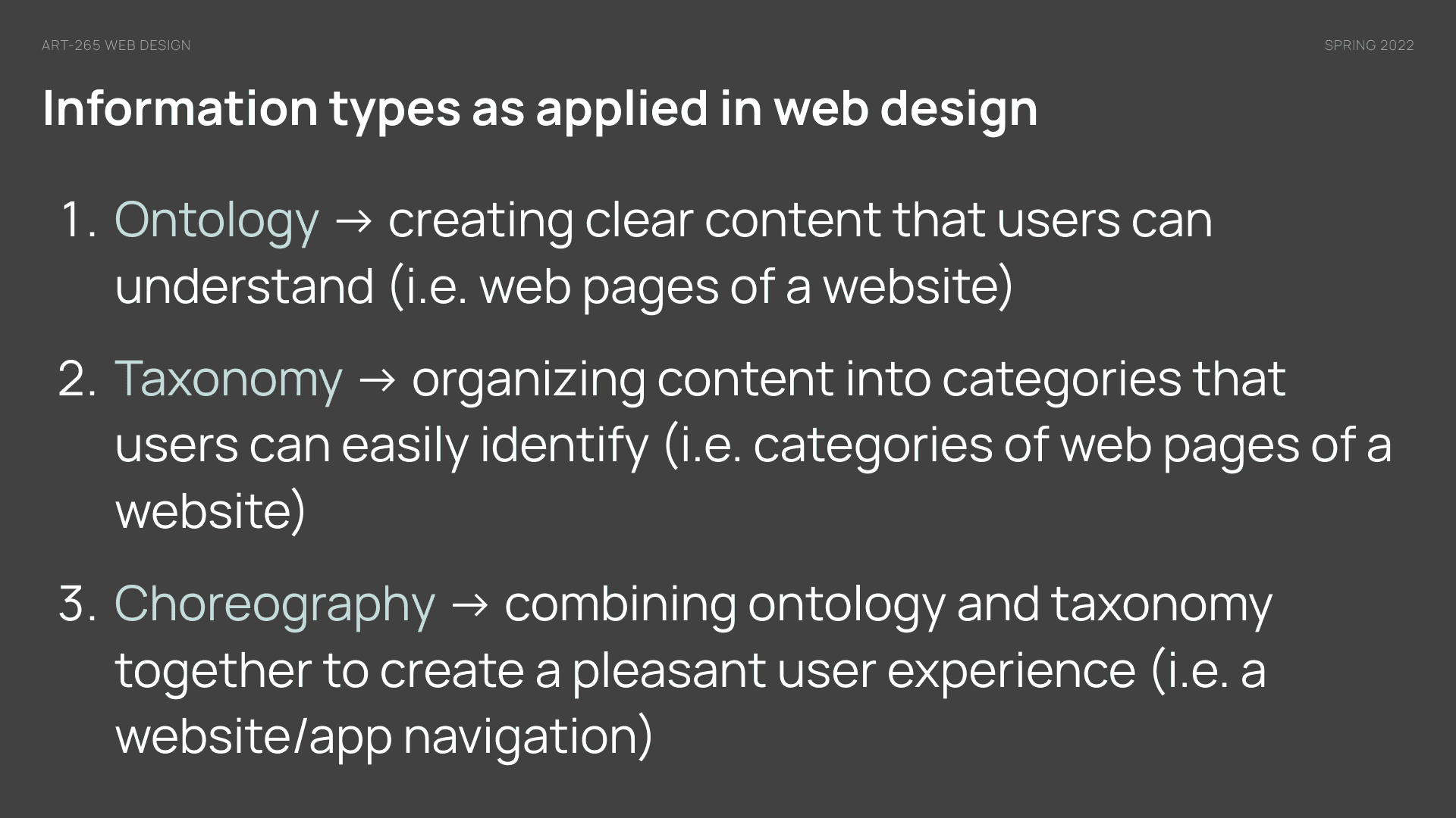
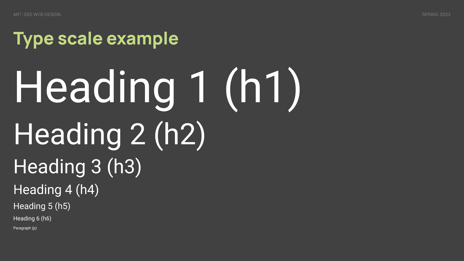
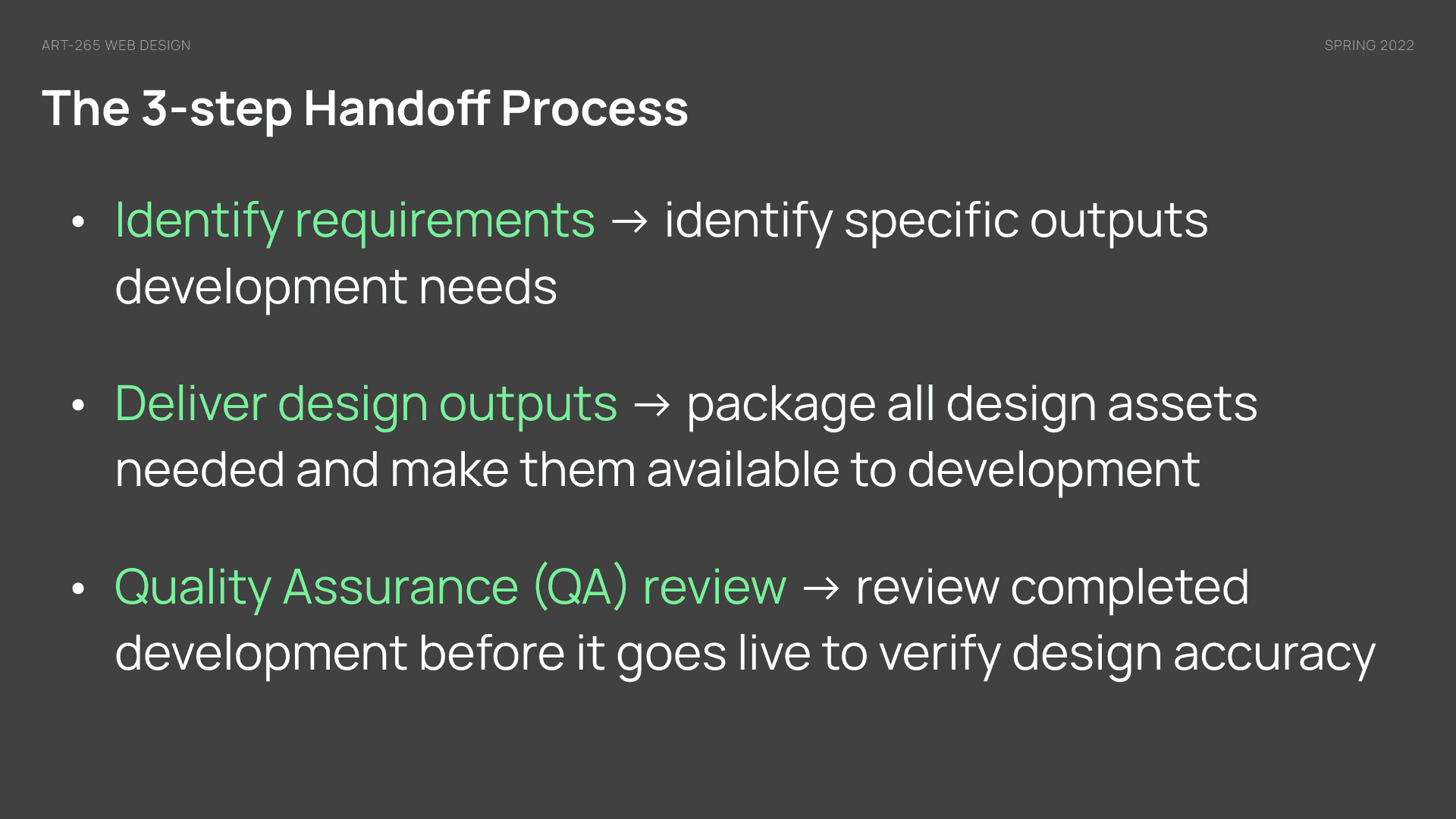
Random sampling of slides
Outcomes
During the course I regularly sought feedback direct from students, and formalized a mid-term evaluation assessment to gauge whether the structure was working. I then asked them again during the last week of class, and got some interesting responses. Some students reacted well to the structure, others communicated that they wanted to see the lectures broken down into smaller chunks for better processing. This was welcome feedback to get so I could make adjustments if asked to teach this class again.
Reflection
One of the most challenging aspects of designing for this class was not knowing how students would react to the structure and course topics. Thankfully majority of students responded well, but I also took note of things to improve upon should I teach this class again including finding more ways to create engagement opportunities, reducing some of the lectures into smaller, more manageable chunks, and creating more space for me to help share what my thinking was when presented with design challenges.