Esri cart flyout
Integrating a familiar e-commerce pattern


My role
UX designer
My responsibilities
UX design and interaction strategy
My methods
UX research, UX design, UI design, rapid prototyping, UX writing
As part of a longer term e-commerce strategy, Esri needed a way to both communicate additional information and allow users to make changes before starting checkout for specific products, including product bundles that support customizing the quantity of products within the bundle.
I designed a modular component with multiple use cases such as add-to-cart summary, ability to change cart quantity of products already in cart, and listing available payment methods. There are other use cases planned for future releases, but the flexibility of the modularized component allows this design to scale and respond to both business and user needs.
Context
Communicating information to customers and helping them make decisions
A common pattern found in many e-commerce experiences is a modal or flyout component that a user sees after they add a product to cart, and typically one step before starting checkout.
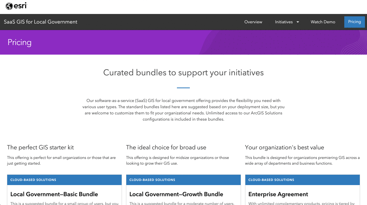
Esri needed a way to both communicate additional information before the checkout process started while also allowing users to make changes before starting checkout for specific products, including product bundles (a collection of two or more products) and the ability to customize the quantity of products within a given bundle.
Process
Balancing business and user needs to reduce friction in the checkout process
Esri's e-commerce business strategy broadly focused on enabling customers to purchase as many products as possible. Featuring over 50 unique products, Esri's product catalog is complex. To help customers during their purchase journey, a cart flyout was envisioned to create the space needed to communicate important details while also capturing key customer input before formally starting checkout. To provide design support for this strategy, I followed three distinct phases that governed my work: research, discovery, and design.
Research
To clearly focus my design effort, I worked with Esri's UX research and e-commerce product management teams to gather data on a) what customers were looking for before completing checkout and b) what products needed users to make decisions before starting checkout. During this part of the process, I interviewed stakeholders in customer support and business development departments, and reviewed customer support tickets that referenced e-commerce and completed order e-mail survey results. I learned the following:
- Customer service received over 1,000 calls related to which payment methods Esri supported for online purchases
- Sales teams needed greater flexibility in building product bundles for specific sales use cases such as consultative sales
- Some customer countries have legal requirements where Esri is required to disclose specific information before starting a purchase transaction (i.e. disclosing VAT in EU countries)
- Product management needed to communicate specific product information to customers (i.e. product compatibility)
- Some customer decision-making is happening in the cart, making it difficult to move through the checkout flow seamlessly (i.e. choosing a configurable option such as operating system or license term)
To help finalize project scope and prepare for design ideation, I crafted problem statements based on these learnings.


Discovery
Moving forward, I knew I needed to design a cart flyout component, and having a clearer understanding of which content the component needed to support based on research outputs, I started a discovery process to better understand how other e-commerce sites a) used cart flyout/modal component experiences and b) what types of content appeared within those components.


Design
After evaluating all of the research and discovery findings, I determined that a modular design pattern would give the most flexibility and maximize the utility of the cart flyout component, especially given its numerous content needs. To help visualize this, I designed a diagram that contained the modules and example scenarios using the modules.


The next part of the design process was designing the actual cart flyout UI. I designed a flyout UI for each module ensuring consistency with Esri's brand type, color, and button patterns.


Once I completed design of the various modules, I moved to design the different combined module scenarios.


The next part of the process was figuring out the actual interaction. Working with an interaction designer and front-end engineer, we landed on a subtle animation that has the flyout combining entering the screen from the right and staying persistent until the user makes an action to either continue to cart to begin the checkout process or to close the flyout to continue shopping.
Outcomes
Evaluated success and opportunities to improve
The cart flyout was a successful project that saw collaboration across many cross-functional teams including product, design, customer support, and sales. The following outcomes were observed:
- Since base module launched, e-commerce sales have seen a YOY increase of 20%
- Modular design creates unlimited possibilities for cross-sell, up-sell, and customer cart management
- Customer service has reported a decrease in calls related to payment methods for e-commerce once the base module that included payment methods launched
Reflection
Incorporate user research for next iterations
Overall, I enjoyed working through the various business and user needs this project uncovered. Esri's business is complex, as is their product portfolio, so anything I can do to help improve the overall e-commerce user experience is a good thing. One interesting aspect of this project is that it began the process of moving some of the decision making moments out of cart. This resulted in alerting the customer to those decision points earlier while also allowing them to make those decisions before completing checkout to decrease the amount of time required to complete orders.
One drawback for this project was the lack of core user research. For next iterations, I'd love to talk to real users and identify areas to improve the design and make it work better for them. There's always a balancing act between ensuring business and user needs are met. This often does not happen equally, but as a UX professional my job is always to advocate for the user.