CBU website redesign
Redesigning the digital face of a university
My role
UX designer, project lead, product manager, and front-end developer.
My responsibilities
UX design, project/product management, team lead
My methods
Content strategy, UX design, copywriting, project management, and front-end development.
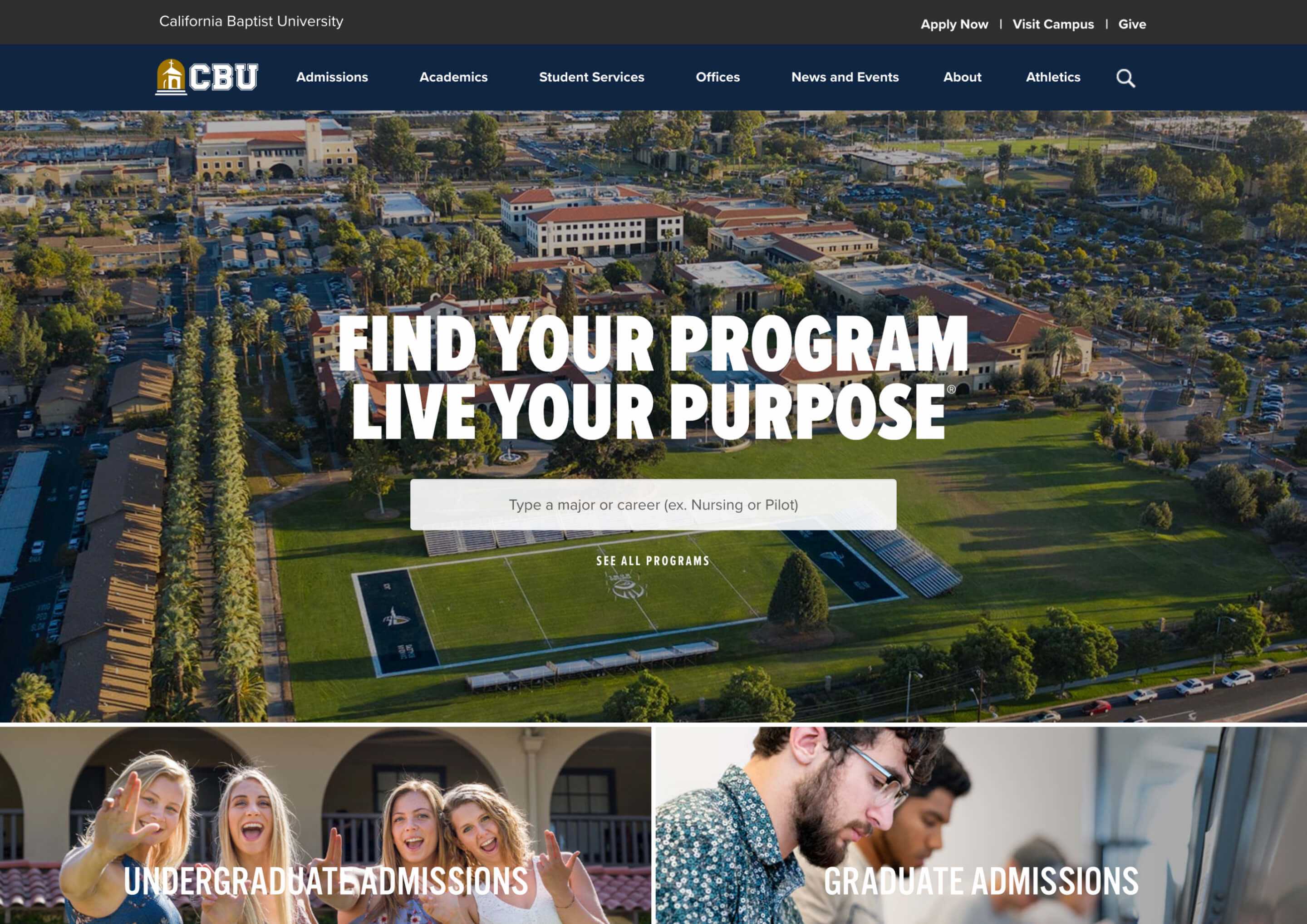
California Baptist University (CBU) is one of Southern California's fastest growing universities. In 2016, CBU had over 8,000 enrolled students and was in the midst of unprecedented growth across the university. I led a project team of designers, developers, and marketers to redesign and implement a website that would make content easier to find for future students and improve page performance (particularly important for international recruitment).
Context
Making a better future student website experience
CBU's existing website in 2015-early 2016 was not meeting expectations from both business objective and student happiness metrics. Part of the problem was a rigid design that made it inflexible for increasingly varied marketing content and admissions requirements, and some significant user experience issues related to poor navigability.
One of the guiding principles for this redesign project was reducing overall complexity and surfacing the content new students (and their parents) were searching for while making college decisions.
Process
Limited time and resources, but a worthy challenge
Due to time and resource constraints, I wore multiple hats on this project: UX designer, front-end developer, project manager, and team lead. I established a process that looked to achieve key milestones and clearly define the project schedule across planning, design, testing, and development phases.
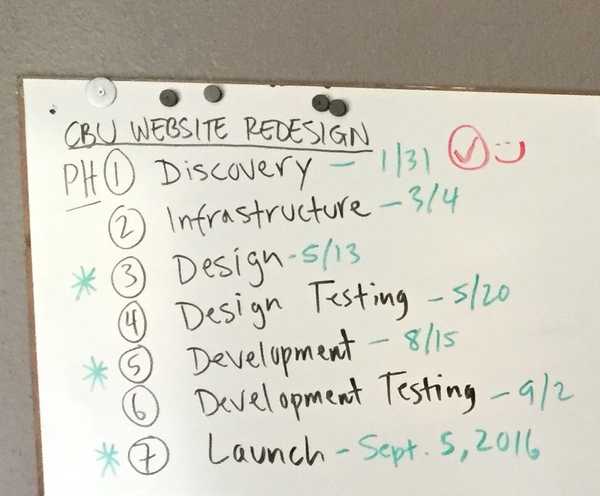
Discovery & Infrastructure
The team started from scratch with an extensive discovery phase. In this phase, the team conducted multiple user interviews of CBU constituents in an effort to understand how CBU’s website was being used. I also performed a competitive analysis and did a deep dive of other university websites as well as websites from other industries in order to identify user patterns and understand how other sites were working (or not working). I also performed a content audit to identify content to keep and content to delete. Finally, the team evaluated the technology platform and selected a new content management system to power the new site.
Collectively, the team identified the major pain points as follows:
- Too many audiences – trying to serve multiple types of users and not doing it well
- Not focused on enrollment – key university objective was an enrollment goal of 10,000 by 2020, and current website was not focused on that goal
- Lack of clarity – no consistency with content, no clear pathways for users, and too much/too little content
Design
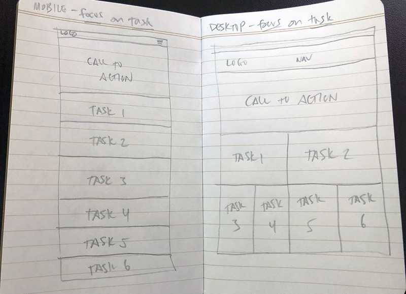
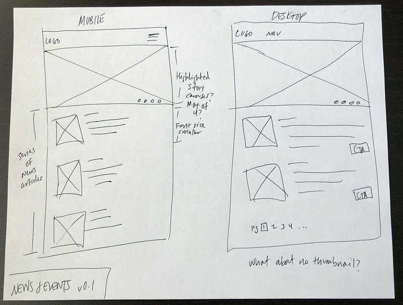
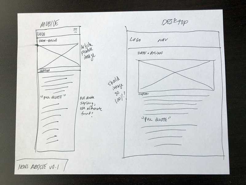
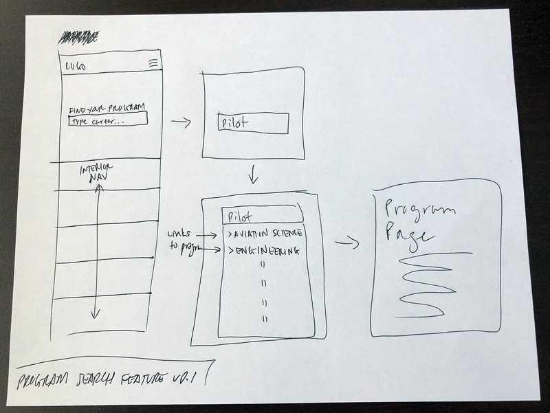
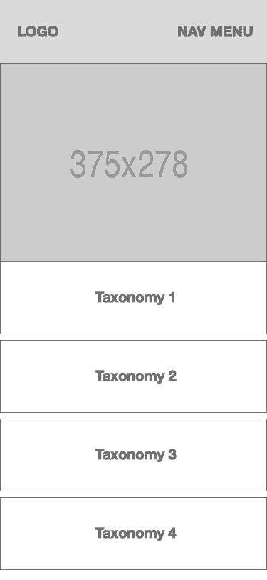
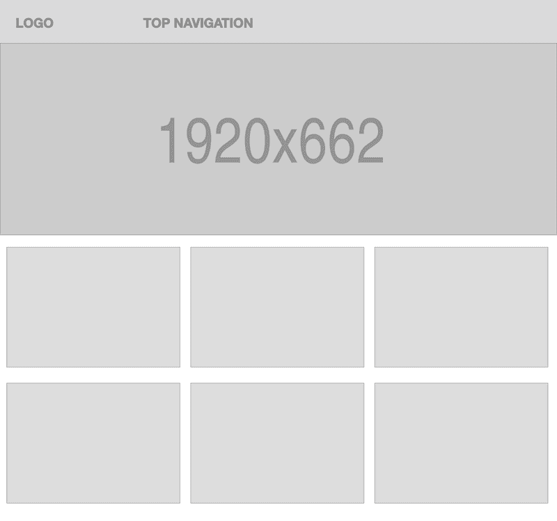
Discovery produced an exhaustive amount of data to help establish where the design direction needed to go. With the three primary pain points in mind, I designed wireframes that adopted a task-based methodology and focused on content clarity. Once wireframes were done, I worked with CBU's art director to transform the wireframes into UI designs.

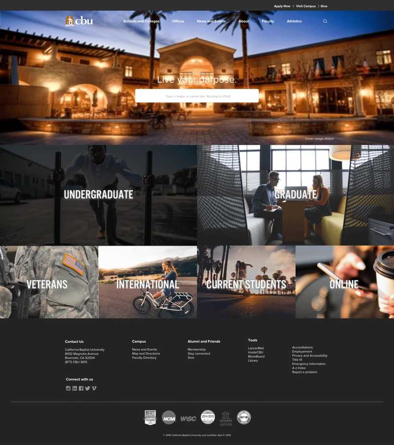

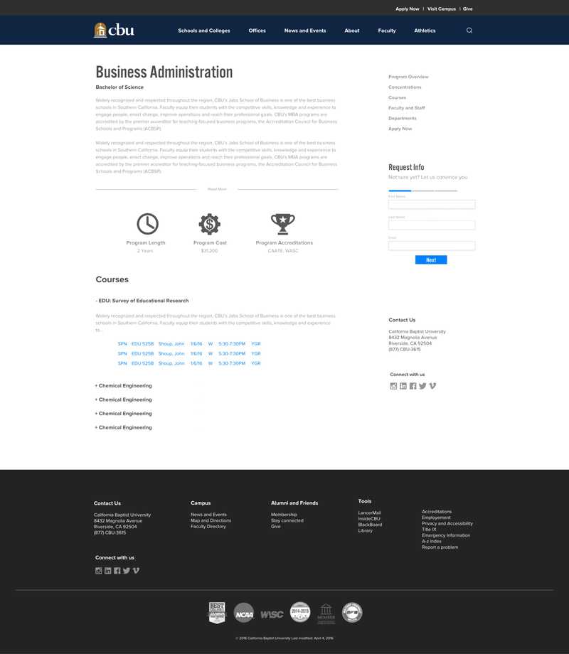

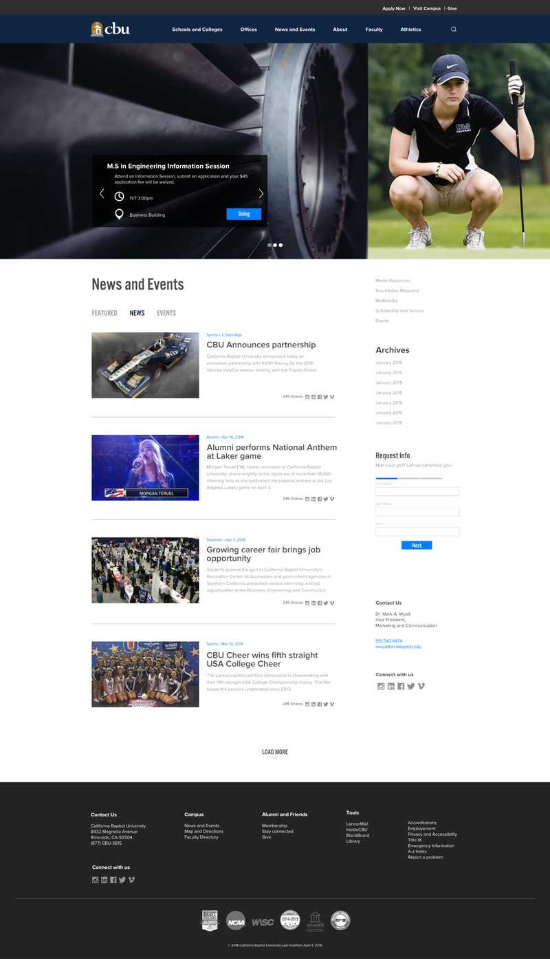
Development
As part of Discovery & Infrastructure phase, we decided to leverage a third-party content management system which required development of templates to support the new design. Using HTML, CSS, JavaScript, and some XML sprinkled in here and there, I developed multiple templates to support the new designs and their content needs. I then worked with the backend developer to integrate the database and page data into the templates.
Outcomes
Practicing user-centered design and strengthening cross-functional collab
At time of writing this case study, this design has yet to ship. However, some positive outcomes were achieved with this project:
- User research and resulting analysis played a critical role in the final design
- Cross-functional partnership between product, engineering, and design strengthened, establishing a blueprint for future collaboration
- Completing this project was an important first step in re-evaluating Matterport's e-commerce strategy to serve customer needs
Reflection
More user research and design iteration
While I'm satisfied with the design process for this project, I would have liked a larger sample size in the earlier user research work. I also want to test the design with users to gauge whether or not it's successful as a solution to the problems uncovered in the research phase. As is always the case with design, it is never done and the next iteration should incorporate learnings from the next round of user research. Finally, I want to create a version of this design for Matterport's SaaS plan that creates parity between the two types of Matterport's product portfolio.