Arousal Architecture™️ assessment
Transforming a paper assessment to an online experience
My role
Freelance product designer, front-end developer
My responsibilities
Product design, front-end development
My methods
UX design, UI design, UX writing, front-end development
Arousal Architecture™️ Assessment is the brainchild of Kayna Cassard, a licensed Marriage and Family Therapist, Sex Therapist, Pelvic Pain Relief Expert and Sexuality Specialist and proprietor of Intuitive Sensuality, a sexual health and wellness practice. The digital Arousal Architecture™️ Assessment website aids Cassard in helping her clients engage in fulfilling relationships with themselves and their partners.
Context
Closing the gap between analog and digital
Kayna Cassard, a licensed Marriage and Family Therapist, Sex Therapist, Pelvic Pain Relief Expert and Sexuality Specialist, approached me about building an online version of her Arousal Architecture™ Assessment. The assessment is one of many tools she uses to help her clients learn how to liberate their sensuality, connect more deeply with themselves and their partners, and ignite passion in all areas of their lives.
At the time, the assessment was an analog process where her clients completed the assessment on paper, and Cassard manually calculated the assessment results. Cassard wanted a digital version of the assessment that served multiple purposes:
- Preserve client session time for therapy
- Empower her clients to complete the assessment ahead of sessions, on their own time, and from within the privacy of their home
- Eliminate manually creating assessment results, saving time for client session prep
Process
Making an engaging online assessment
For this project, I followed a three-phased approach consisting of discovery, design, and development phases.
Discovery
It was important to me that I understood how Cassard used the assessment to ensure that the completed project was useful. After several interviews with Cassard, I gained greater understanding in how she used the assessment and from there I was able to establish a scope of work. Then, I surveyed the landscape and performed a competitive analysis.
From there I identified three goals for the project based on Cassard’s own goals from above:
- Design an easy-to-use assessment that avoids user fatigue due to the quantity of questions asked (50)
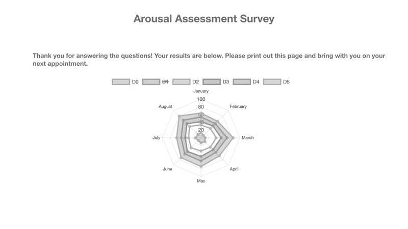
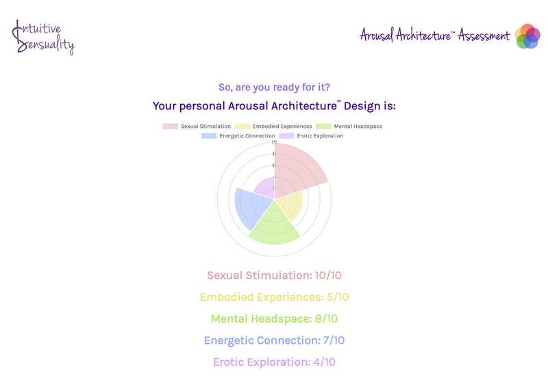
- Ensure assessment clients have access to their results post-completion (via a chart for quick summarization)
- Further promote Cassard’s brand and practice
Design
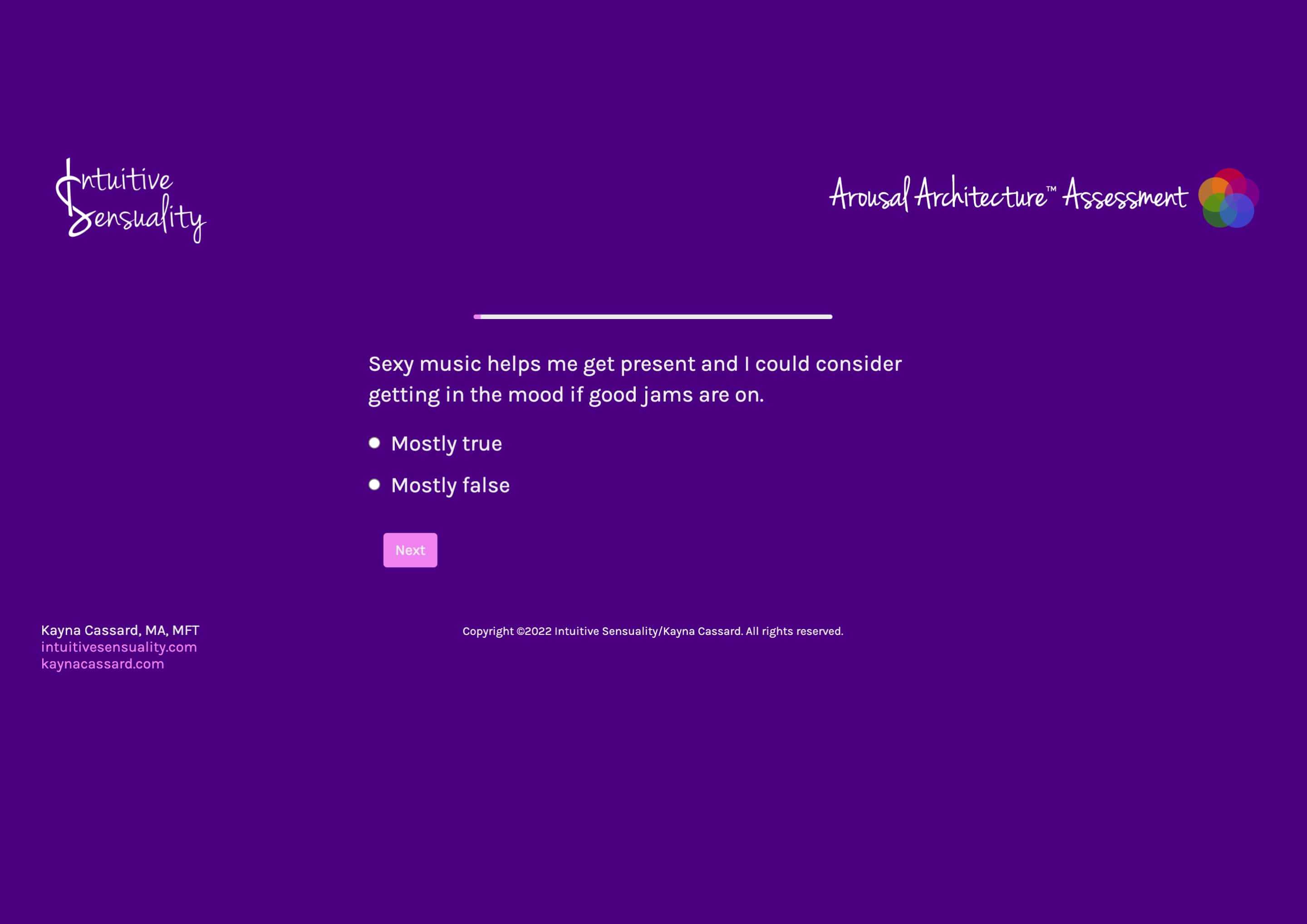
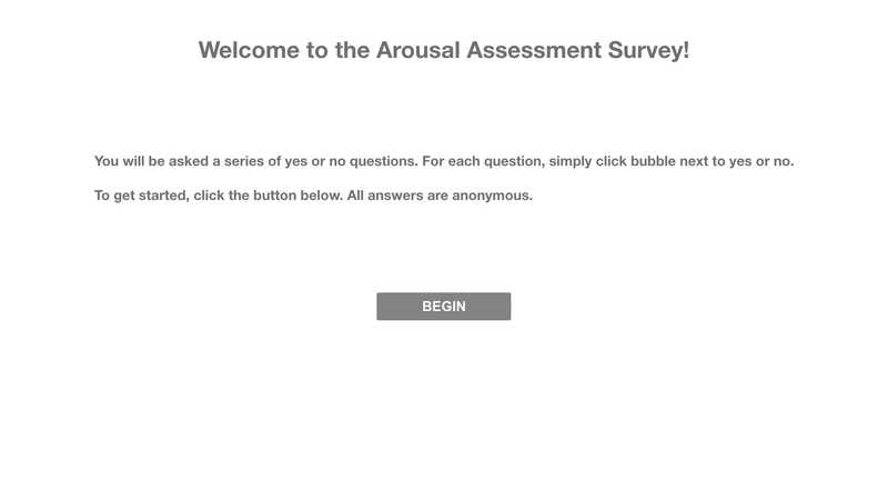
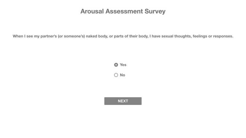
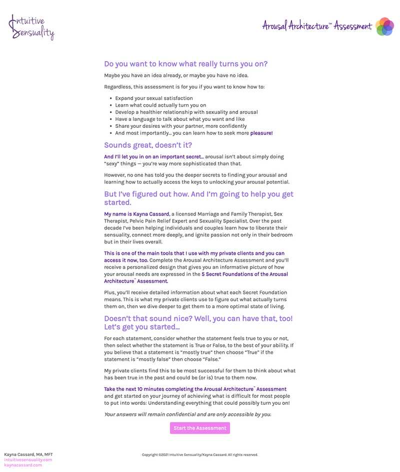
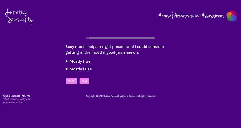
My next step was to create wireframes to help me identify how the experience might function. The assessment includes 50 questions, and because of the complexity of these questions, one of my top priorities was ensuring that the design embraced simplicity to ensure the best user experience and reduce user fatigue. Once I reviewed the wireframes with Cassard, I moved to designing the UI. This included aligning color and fonts to Cassard’s existing brand while also using color and contrast to establish a sense of place during the question and answer portion of the assessment.
Development
Once designs were finalized and approved by Cassard, I went to work building the website. Since there was limited need for dynamic content, and no need for any kind of database backend or storage (for user privacy), I decided to use a static site generator with a flat file structure to maximize performance.
I converted the questions into a parsable data file, then went to work leveraging third-party open source libraries for the survey component interaction and results chart generation, with some extra bits sprinkled in for marketing automation that tied back into Cassard's existing MarTech stack.
Outcomes
Achieving client happiness
Cassard was thrilled with the final result of this project, and has since shared this has been an excellent addition to her toolchest in her practice. The ability for Cassard's clients to complete this survey on their own time and in private has fostered greater honesty and communication during sessions.
Reflection
The more I learn the more I don't know
This was an amazing project because it allowed me to not only learn about a completely different world than I’m used to, but also challenged me at all phases of this project. The design phase required that I practice patience and really focus on the simple mechanics of questionnaires/surveys in order to maximize user happiness. Similarly, the development phase challenged me in new ways because I had never built something this complex before. In future iterations, I’d love to do some testing to gauge how users feel when taking the assessment as well as identify areas to improve user happiness.