Matterport product page
Elevating product details to improve the purchase experience

My role
Product designer
My responsibilities
Product design
My methods
UX research, UX strategy, UI design
Matterport's existing e-commerce platform strategy was focused on getting the customer through the purchase flow as quickly as possible. This meant that important details customers needed to make decisions were missing, creating an opportunity.
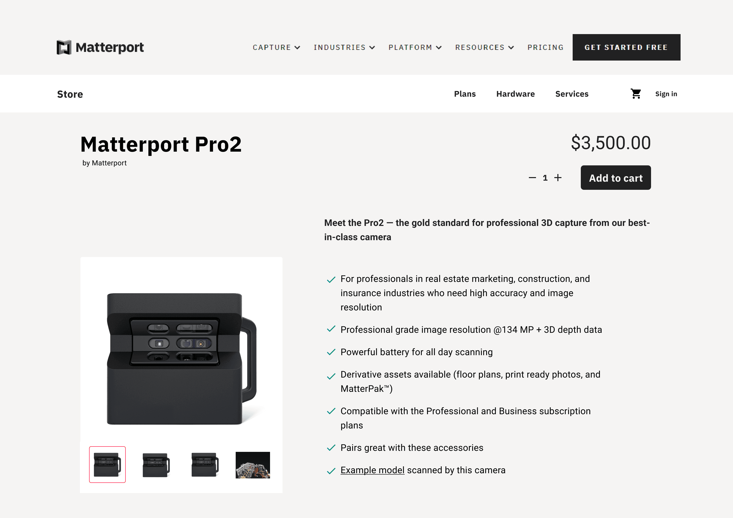
Based on user research results and customer survey data, I designed a new product page to help increase customer education by elevating product differentiators and product relationships.
Context
Improving the e-commerce UX strategy to meet customer expectations

A critical piece of most e-commerce strategies, product pages are well-known to help increase buyer awareness and foster greater purchase conversion. Matterport's existing e-commerce platform strategy was focused on getting the customer through the purchase flow as quickly as possible and lacked product detail pages.
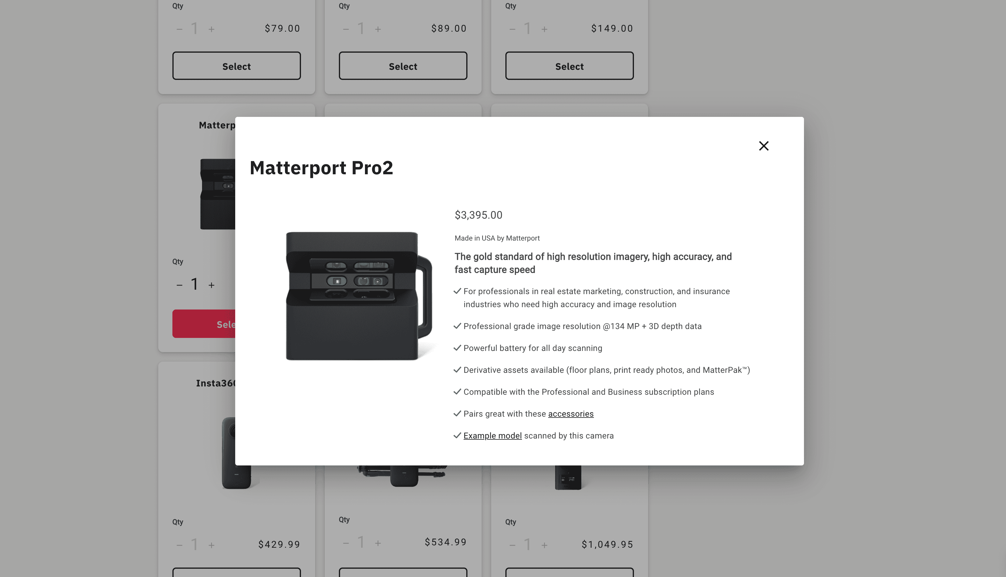
The current design adopted a product details modal rather than a product details page. This meant that important details customers needed to make purchase decisions were missing, which created an opportunity for further exploration and research into what problems the customers were facing during their purchase decision-making process.
Process
Understanding user needs to create effective solutions
Matterport's e-commerce business strategy broadly focused on actions to help customers complete e-commerce transactions. To provide design support for this strategy, I followed three design phases: research, discovery, and design.
Research
To help understand which areas to focus on, I worked with Matterport's UX research team to design and moderate user interviews. Over the course of two weeks, we interviewed 10 customers and synthesized these key takeaways:
- Some customers reported not enough product information with the current modal experience
- Nearly all customers complained that there was no easy way to find additional product details
- A handful of customers completed purchases directly from sites like Amazon and B&H because they did a better job of explaining product details
- Many users were unaware of some of the other products Matterport sells
I also reviewed customer survey data to identify any e-commerce specific feedback. Not unsurprisingly, I found similarities between what we observed during user research and what was reported directly by customers where they shared their frustrations with the purchase experience.
Discovery
Equipped with research results, I went about investigating how other e-commerce sites use product detail pages (or if they followed a similar strategy to Matterport and didn't use them). As part of this discovery process, I performed a content audit and noted different types of content I found. This was important for two reasons: 1) identifying patterns and 2) establishing benchmarks to measure designs against.

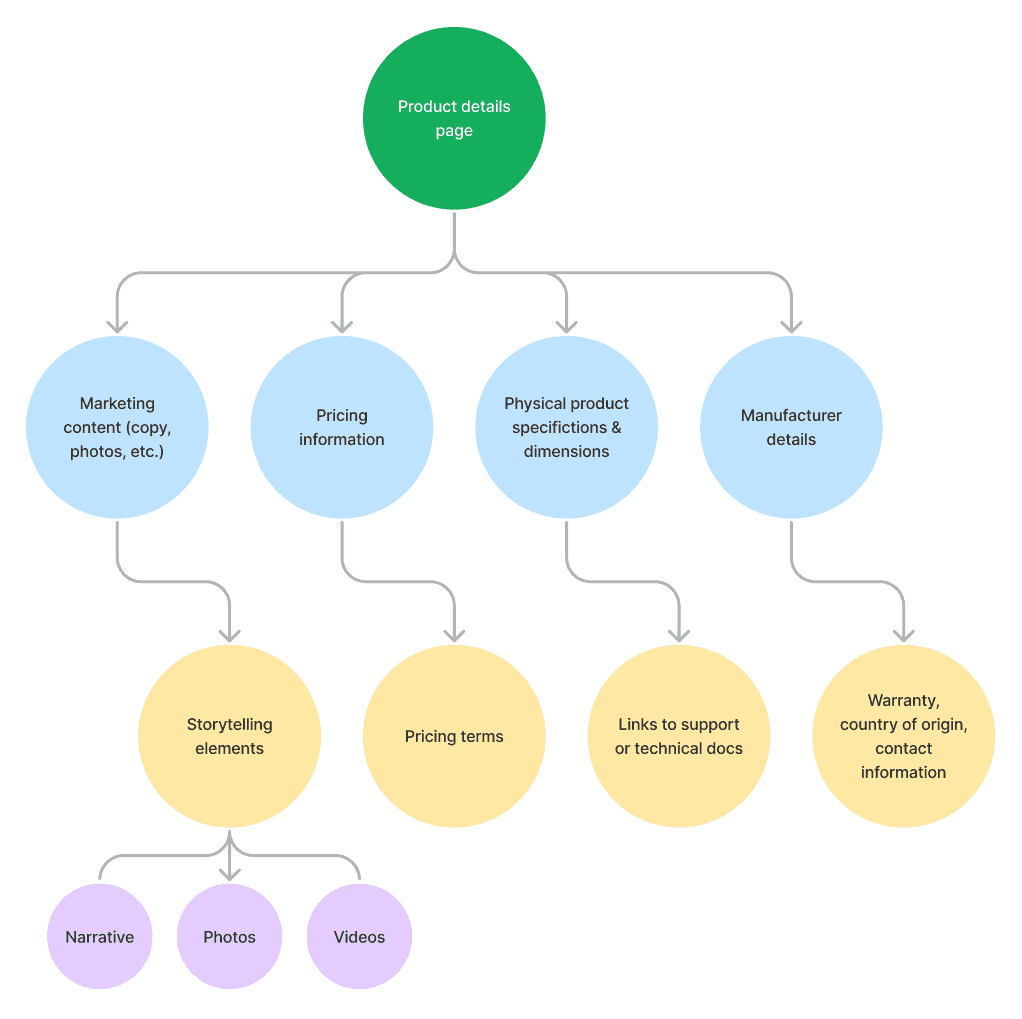
Using the competitive content audit, I drew up a flow diagram to help me better visualize the types of content to target in my design.

I also used this time to work with product management and engineering cross-functional partners to involve them in the process and better understand any challenges or issues that might affect the design.
Design
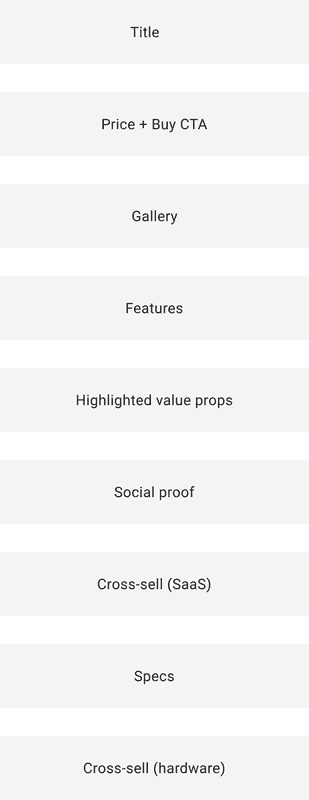
Leveraging the research and discovery work, I started the design phase by trying to answer a question: what would a Matterport product detail page look like? My first task was to create a content hierarchy, a UX technique I've used before to help me establish the page's story. I then took the content hierarchy and created a wireframe.


With my initial page design structure established, I then designed the UI for the page, using Matterport's Supernova design system to ensure consistency with colors, type, and components such as buttons.

Outcomes
Practicing user-centered design and strengthening cross-functional collab
At time of writing this case study, this design has yet to ship. However, some positive outcomes were achieved with this project:
- User research and resulting analysis played a critical role in the final design
- Cross-functional partnership between product, engineering, and design strengthened, establishing a blueprint for future collaboration
- Completing this project was an important first step in re-evaluating Matterport's e-commerce strategy to serve customer needs
Reflection
More user research and design iteration
While I'm satisfied with the design process for this project, I would have liked a larger sample size in the earlier user research work. I also want to test the design with users to gauge whether or not it's successful as a solution to the problems uncovered in the research phase. As is always the case with design, it is never done and the next iteration should incorporate learnings from the next round of user research. Finally, I want to create a version of this design for Matterport's SaaS plan that creates parity between the two types of Matterport's product portfolio.